ここでは、デフォルトの設定で書いたFig. 1 からどのように最終版のFig. finを作るかを説明してきます。
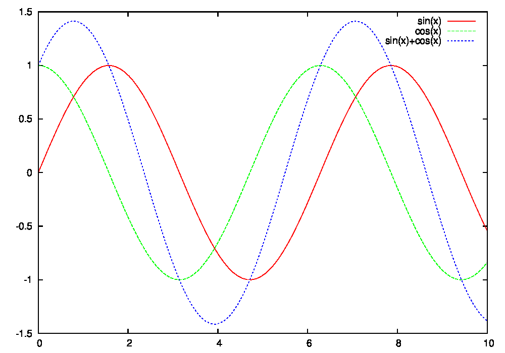 |
| Fig. 1 デフォルトの設定でのプロット。 |
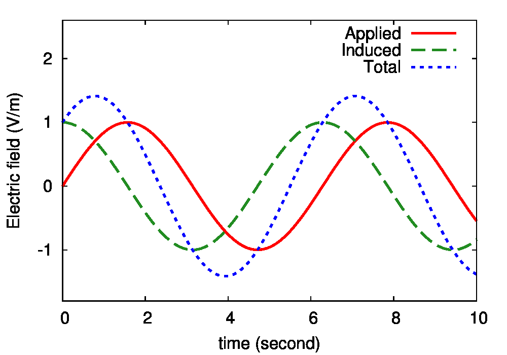 |
| Fig. fin 論文用の図の最終版。 |
デフォルトのプロット
デフォルト・オプションの図は以下のpltファイルを用いて作成しました。plot01.plt
set term postscript eps enhanced color
set output "plot01.eps"
p [0:10] sin(x) w l,cos(x) w l,sin(x)+cos(x) w l
unset output
それでは、このpltファイルを修正して、より質の高い図を作っていきましょう。
次のような順序で、このFig.1 からFig.fin へとバージョンアップしていきます。
Plot02: 線を太くする。
Plot03: 見えにくい来緑色を暗い緑色を修正する。
Plot04: 描画する範囲を設定。
Plot05: x軸とy軸に名前を付ける。
Plot06: 文字の大きさ、フォント、及び破線の長さを設定する。
Plot07: 凡例をつける 。
Plot02: 線を太くする。
まずは、図を見やすくするために線を太くします。線の太さは line width (数字) のオプションで変更することができます。
また、このline width オプションは lw と略して記述することもできます。
以下の plot02.plt の例では、lw 6 のオプションを追加することによって線を太くしています。
このplot02.pltによって描かれた図を図.2に示しています。
plot02.plt
set term postscript eps enhanced color
set output "plot02.eps"
p [0:10] sin(x) w l lw 6\
,cos(x) w l lw 6\
,sin(x)+cos(x) w l lw 6
unset output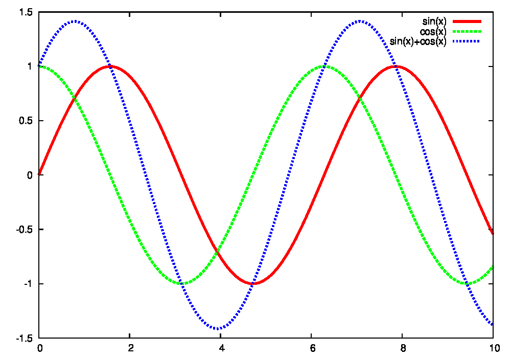 |
| Fig. 2, plot02.pltによって描かれた図。 |
Plot03: 見えにくい来緑色を暗い緑色を修正する。
次にgnuplotのデフォルト設定で描かれる黄緑色を修正します。デフォルトの黄緑色は、スライドや論文に使うと非常に見づらいです。
ここでは、この黄緑色を暗い緑色に変更しています。
gnuplot で線の色を変更するにはline color オプションを使います。
このline color オプションもlcと略して記述することができます。
通常はlwなどと同様に、lc 2 のようにlcの後に数字を記述することで色を指定することができます。
しかし、ここではrgbコマンド lc rgb "forest-green" を使って、暗い緑色を直接指定します。
plot03.plt
set term postscript eps enhanced color
set output "plot03.eps"
p [0:10] sin(x) w l lw 6\
,cos(x) w l lw 6 lc rgb "forest-green"\
,sin(x)+cos(x) w l lw 6
unset output
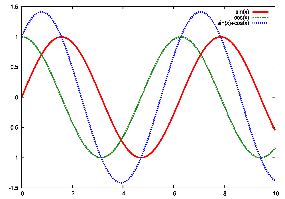 |
| Fig. 3, plot03.pltによって描かれた図。 |
Plot04: 描画する範囲を設定。
次に、図を見やすいように描画範囲を設定します。x方向,y方向の描画範囲はそれぞれ set xrange[0:10] や set yrange[-1.8:2.6] などと記述して指定することができます。
さらに、軸のメモリの間隔を set ytics 1 などと記述して調整することができます。
plot04.plt
set term postscript eps enhanced color
set output "plot04.eps"
set ytics 1
set xrange [0:10]
set yrange [-1.8:2.6]
p sin(x) w l lw 6\
,cos(x) w l lw 6 lc rgb "forest-green"\
,sin(x)+cos(x) w l lw 6
unset output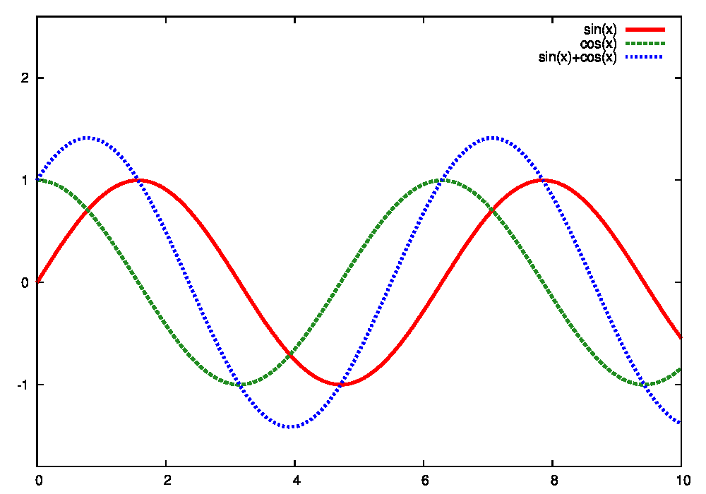 |
| Fig. 4, plot04.pltによって描かれた図。 |
Plot05: x軸とy軸に名前を付ける。
次に、x軸とy軸にそれぞれ名前をつけます。軸に名前を付けるためにはset xlabel 及び set ylabel オプションを用います。
以下の例では、x軸を時間 Time (secoond), y軸を電場 Electric field (V/m) としています。
plot05.plt
set term postscript eps enhanced color
set output "plot05.eps"
set xlabel "Time (second)"
set ylabel "Electric field (V/m)"
set ytics 1
set xrange [0:10]
set yrange [-1.8:2.6]
p sin(x) w l lw 6\
,cos(x) w l lw 6 lc rgb "forest-green"\
,sin(x)+cos(x) w l lw 6
unset output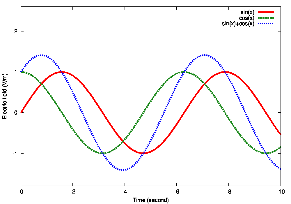 |
| Fig. 5, plot05.pltによって描かれた図。 |
Plot06: 文字の大きさ、フォント、及び破線の長さを設定する。
次に、図中の文字の大きさ、フォント、及び破線の長さの調整を行います。Fig.5までの図では、図中の文字が小さくてスライドや論文に載せた時に見づらいです。
これを改善するために、図中の文字サイズを大きくします。
文字サイズ・フォントを指定するためには font コマンドを用います。
以下では、 font "Arial, 24" と記述することで、文字サイズを大きくしています。
また、図中の緑色の破線と青色の点線の区別が難しい状態になっています。
これを改善するために、破線の長さを伸ばして、より破線らしくします。
このためにset term の後に
dashed dashlength 5 を追加します。この dashed dashlength の後の数字が大きくなるほど、破線の長さが伸びます。
plot05.plt
set term postscript eps enhanced color font "Arial, 24" dashed dashlength 5
set output "plot06.eps"
set xlabel "Time (second)"
set ylabel "Electric field (V/m)"
set ytics 1
set xrange [0:10]
set yrange [-1.8:2.6]
p sin(x) w l lw 6\
,cos(x) w l lw 6 lc rgb "forest-green"\
,sin(x)+cos(x) w l lw 6
unset output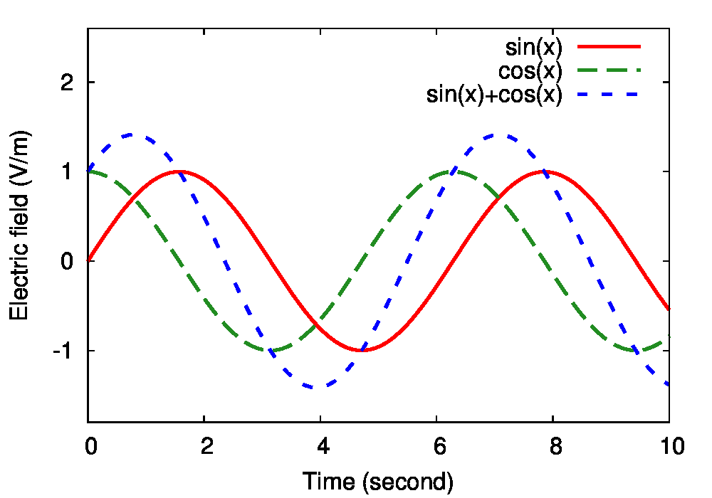 |
| Fig. 6, plot06.pltによって描かれた図。 |
Plot07: 凡例をつける 。
最後に、それぞれの線に凡例をつけます。凡例を付けるためには、title オプションを用います。以下の例では、 title "Applied" などと記述して、それぞれの先に凡例をつけています。
plot07.plt (plot_fin.plt)
set term postscript eps enhanced color font "Arial, 24" dashed dashlength 5
set output "plot07.eps"
set xlabel "Time (second)"
set ylabel "Electric field (V/m)"
set ytics 1
set xrange [0:10]
set yrange [-1.8:2.6]
p sin(x) title "Applied" w l lw 6\
,cos(x) title "Induced" w l lw 6 lc rgb "forest-green"\
,sin(x)+cos(x) title "Total" w l lw 6
unset output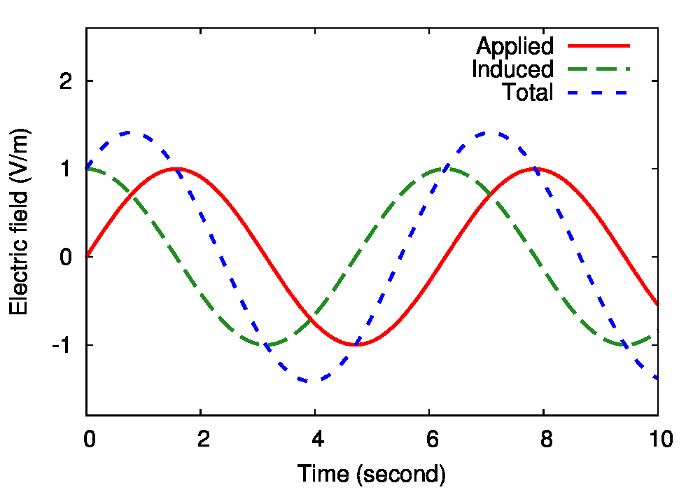 |
| Fig. 6, plot06.pltによって描かれた図。Fig. fin と同じもの。 |
0 件のコメント:
コメントを投稿